
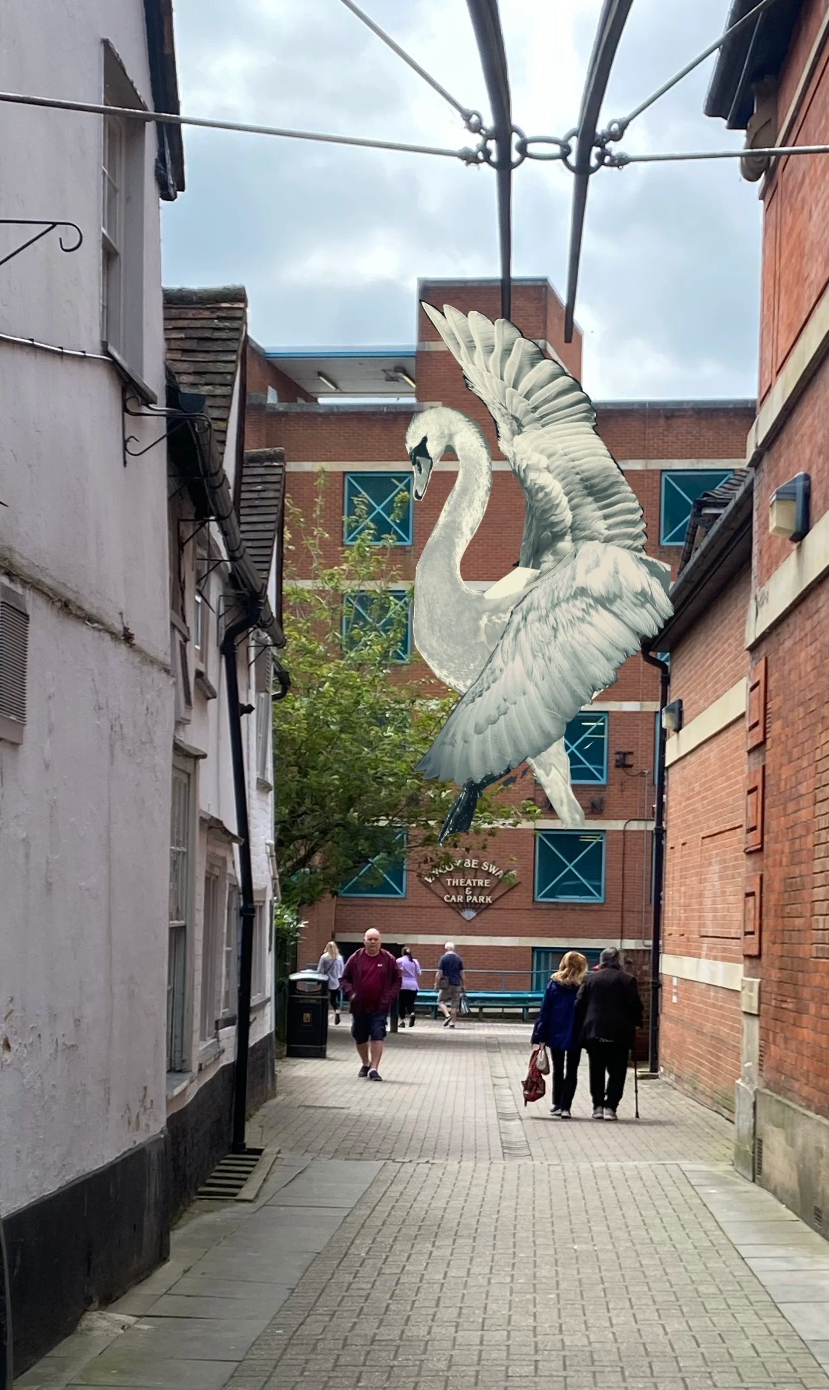
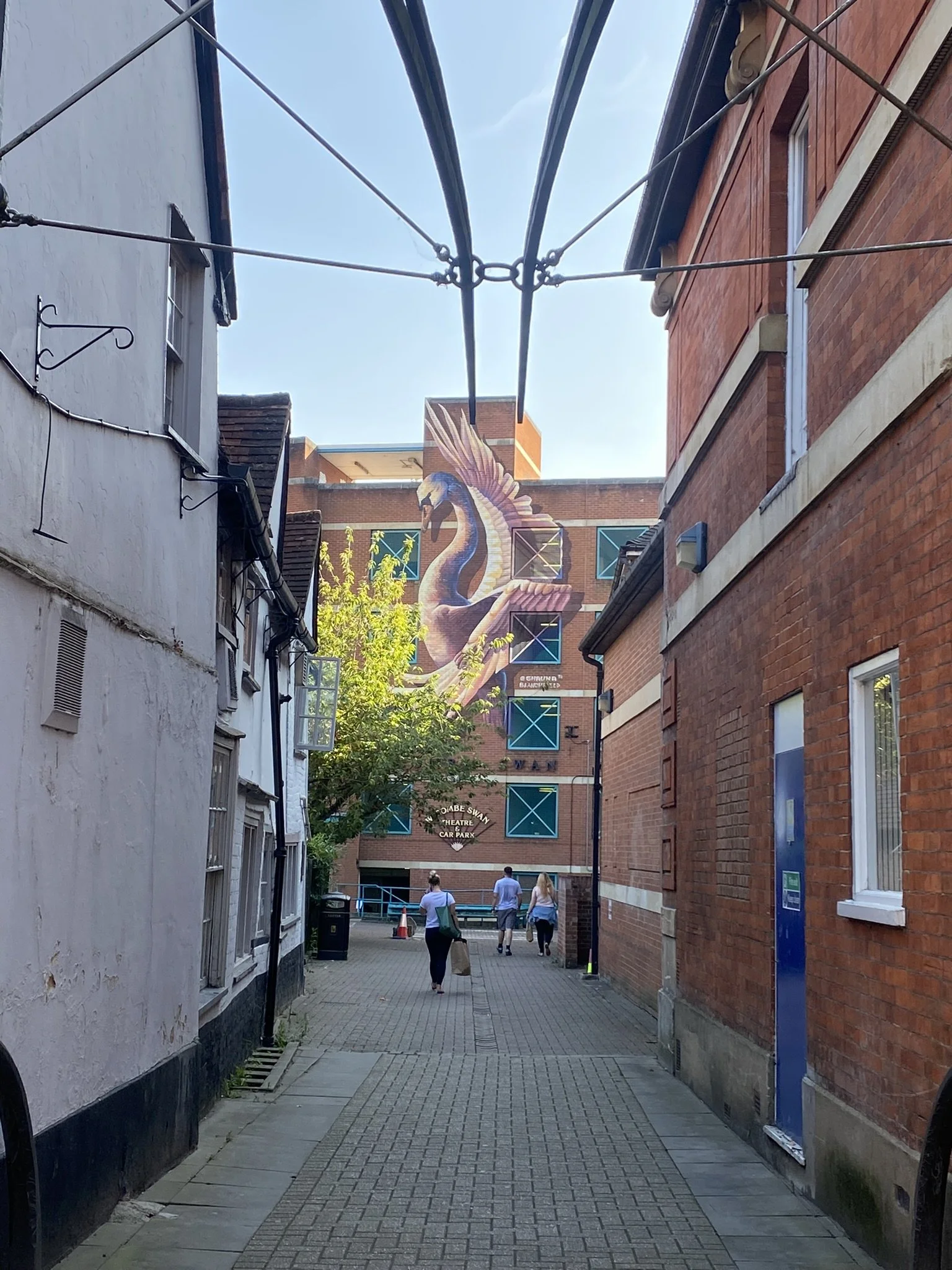
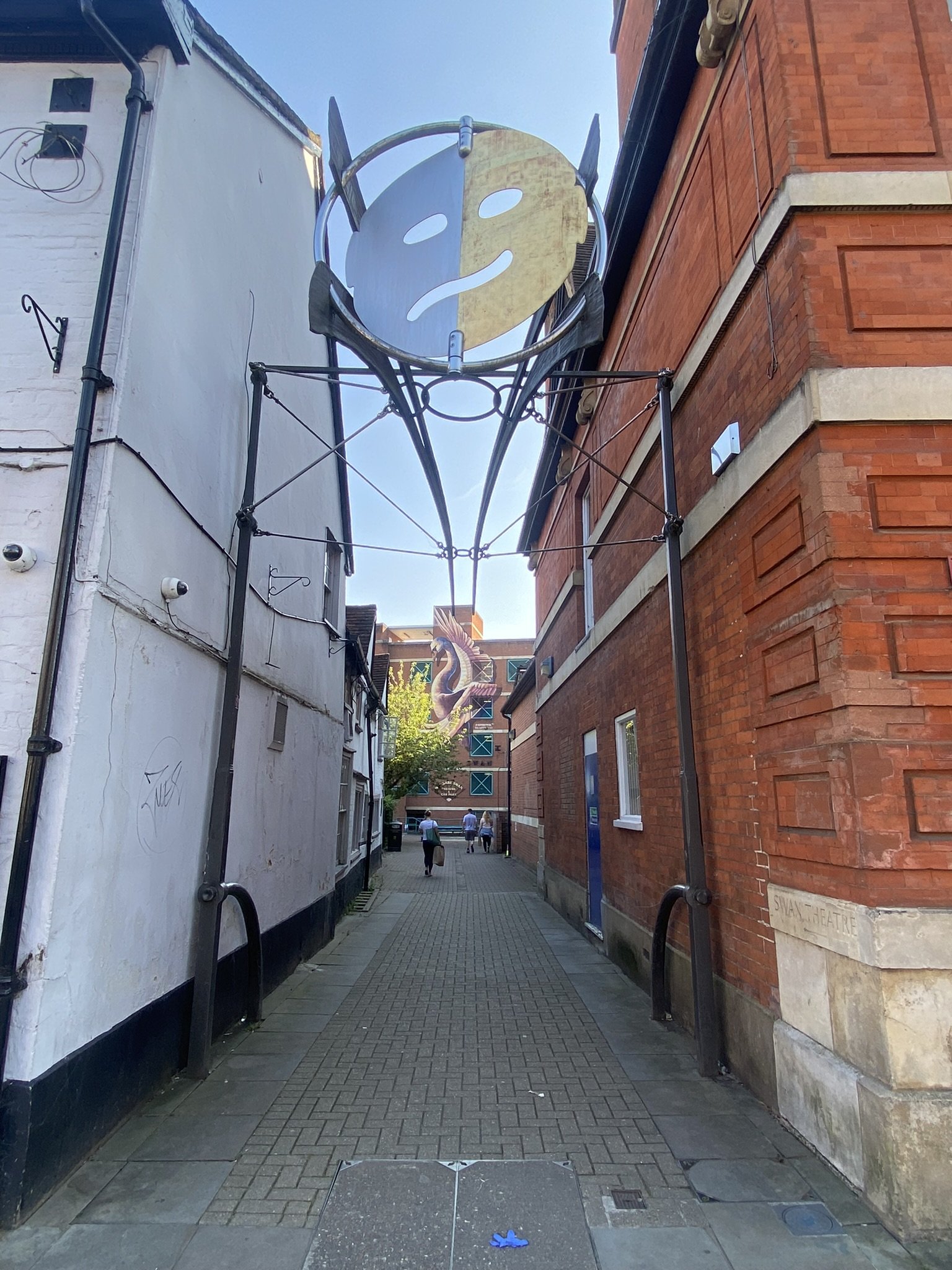
The Wycombe Swan
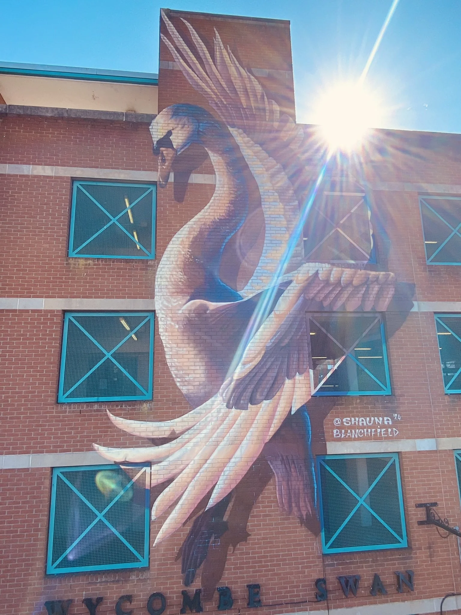
The Wycombe Swan mural on the facade of the carpark attached to The Wycombe Swan Theatre.
Location: High Wycombe, Buckinghamshire
Client: Buckinghamshire Council (Regeneration Team)
Site type: Cultural quarter / town centre regeneration
Role: Lead artist
Year: 2024
Outcome: A four-storey mural became an instantly recognisable landmark and wayfinding anchor for High Wycombe’s cultural quarter.
Key Takeaway: A single, legible landmark image created a clear arrival point for a cultural quarter, demonstrating how focused placemaking can support wayfinding and identity at scale.
The Context
As part of the regeneration of High Wycombe’s cultural quarter, the council sought a strong visual marker to help define the area and improve legibility for visitors accessing the Wycombe Swan Theatre and surrounding venues.
The site was the blank brick façade of a multi-storey car park, prominent, highly visible, and difficult to work with. The brief called for a bold intervention that could signal arrival, create orientation, and establish a clear identity for the area without overcomplicating the message.
This was not a space that needed explanation. It needed a symbol.
The Challenge
Conceptual constraints:
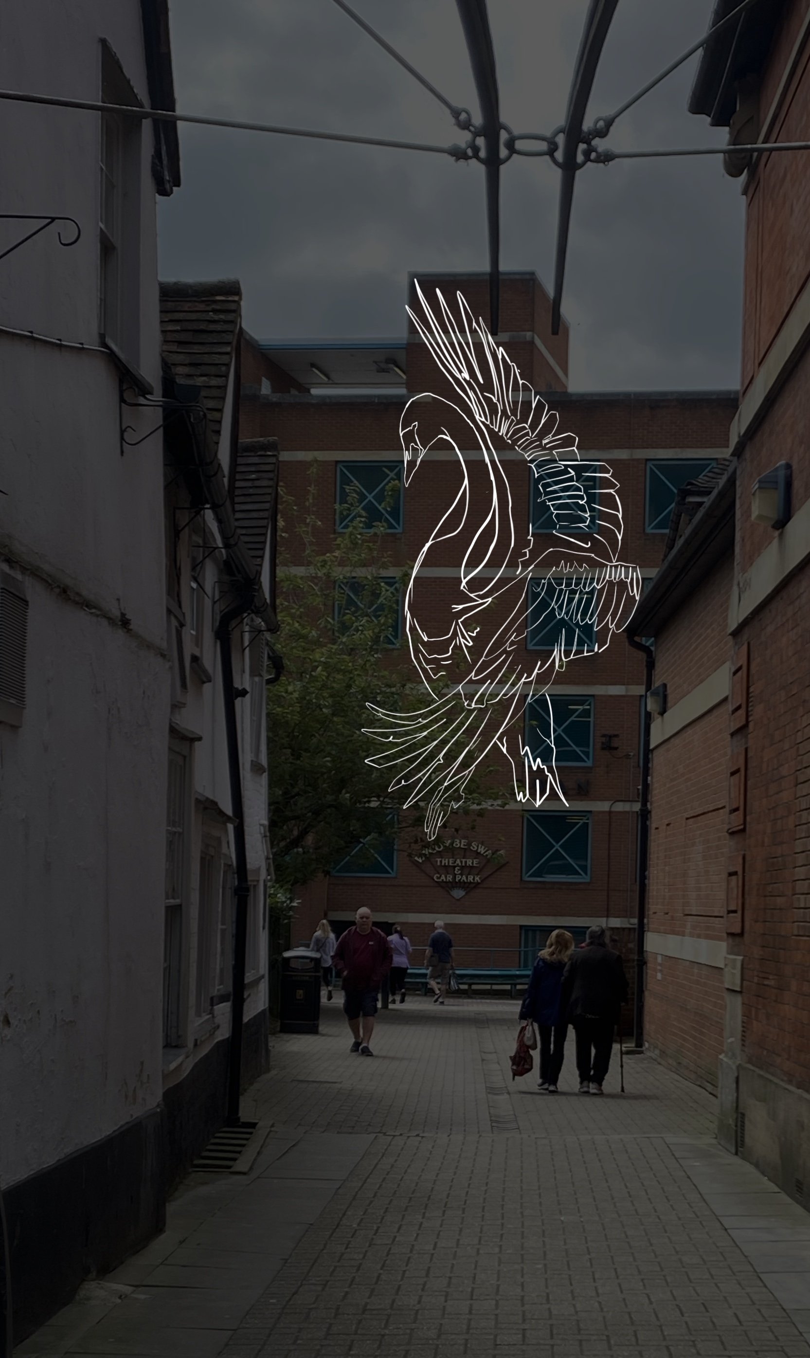
The swan is an inherently horizontal creature. Translating it into a vertical, four-storey composition that felt natural, recognisable, and elegant required extensive experimentation. The image had to read instantly as “a swan” without viewers needing to intellectually resolve its unusual proportions.
Physical constraints:
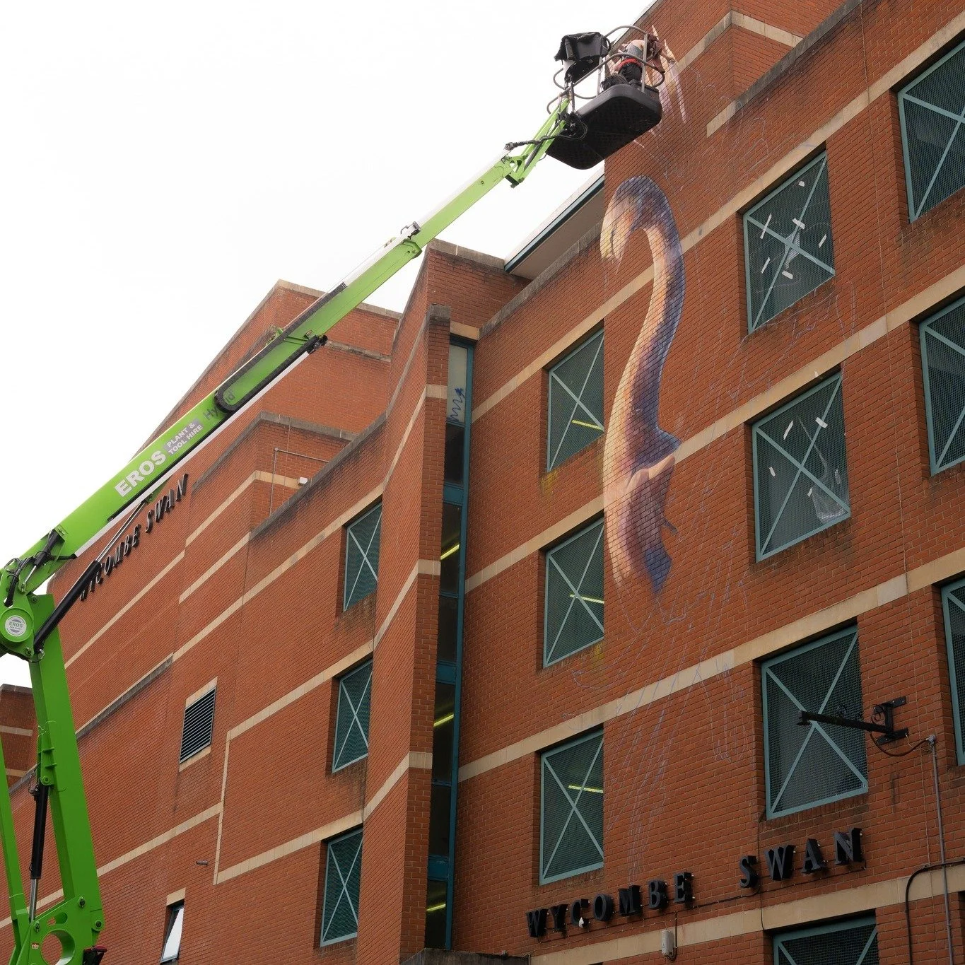
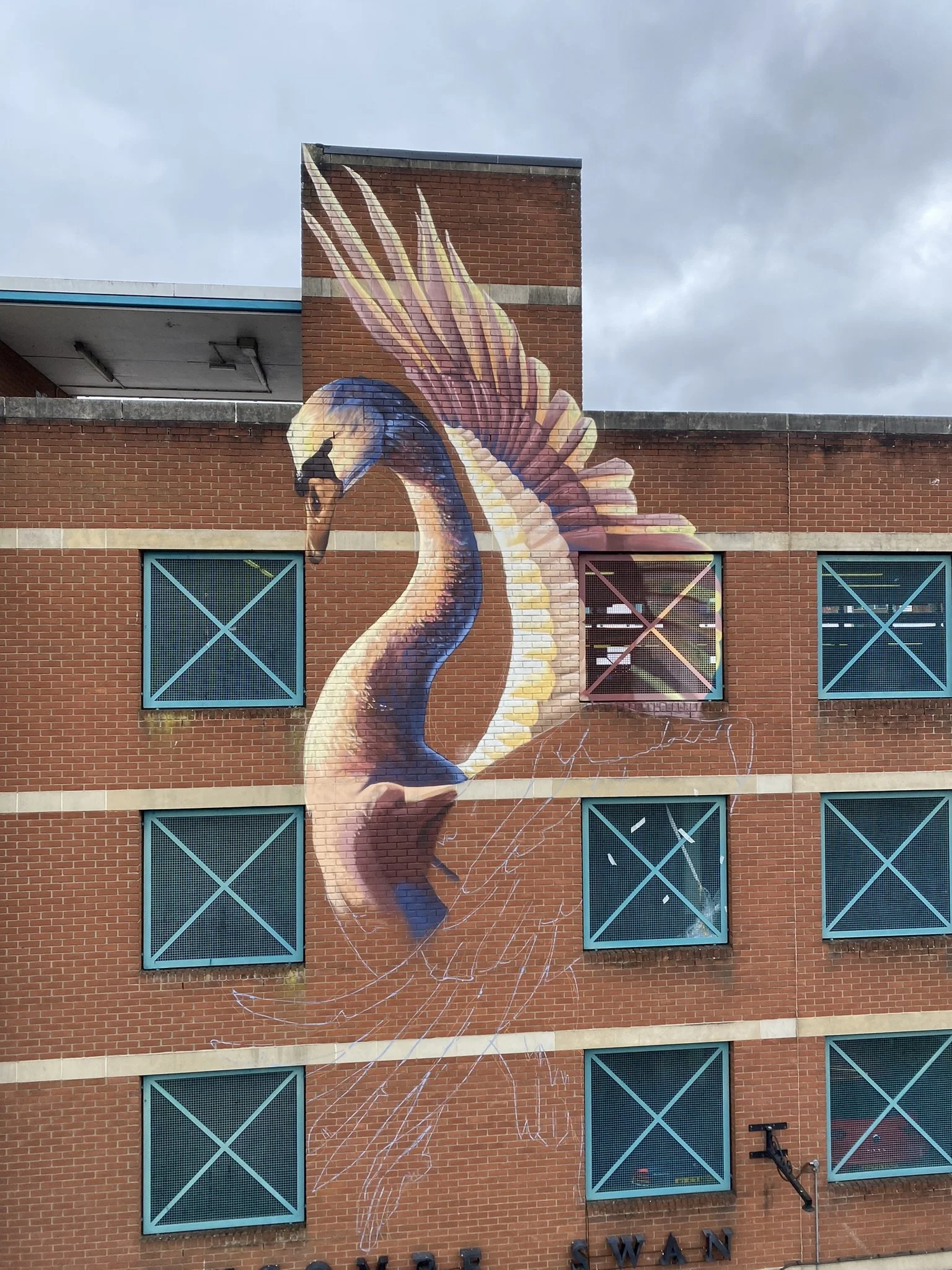
The mural wraps around existing architectural features and signage. The body of the swan needed to navigate windows, edges, and negative space without losing coherence.
Technical constraints:
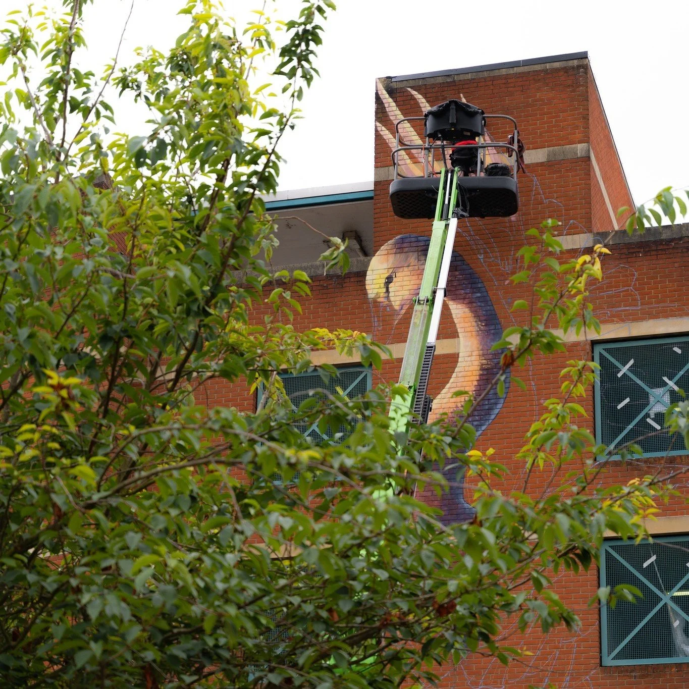
The brick surface was left unprimed by design to allow for slow weathering to a lime-wash effect consistent with High Wycombe’s historic visual language. This required extreme precision: overspray had to be avoided entirely, as there was no background layer to correct mistakes.
Strategic constraints:
This was a highly visible public-facing project within an active regeneration programme. The work needed to be confident, legible, and delivered cleanly within programme constraints.
The Approach
The conceptual starting point combined multiple layers of meaning:
the swan as a British civic symbol
its association with poise above water and unseen labour beneath
echoes of The Children of Lír, an Irish myth of transformation and endurance
The challenge was not adding symbolism, but distilling it.
The image went through numerous iterations, combining photographic research, collage, and repeated sketching to find a form that would:
read instantly as a swan
work vertically across four storeys
feel calm and authoritative rather than decorative
In this instance, deeper community co-design was intentionally not the right tool. The subject matter was already embedded in the site’s identity: the building houses the Wycombe Swan Theatre, and the swan as symbol was self-evident.
Here, placemaking was best served by a singular, disciplined vision, developed in close collaboration with the council’s regeneration team. That clarity allowed sufficient time to resolve a complex image in a difficult space without dilution.
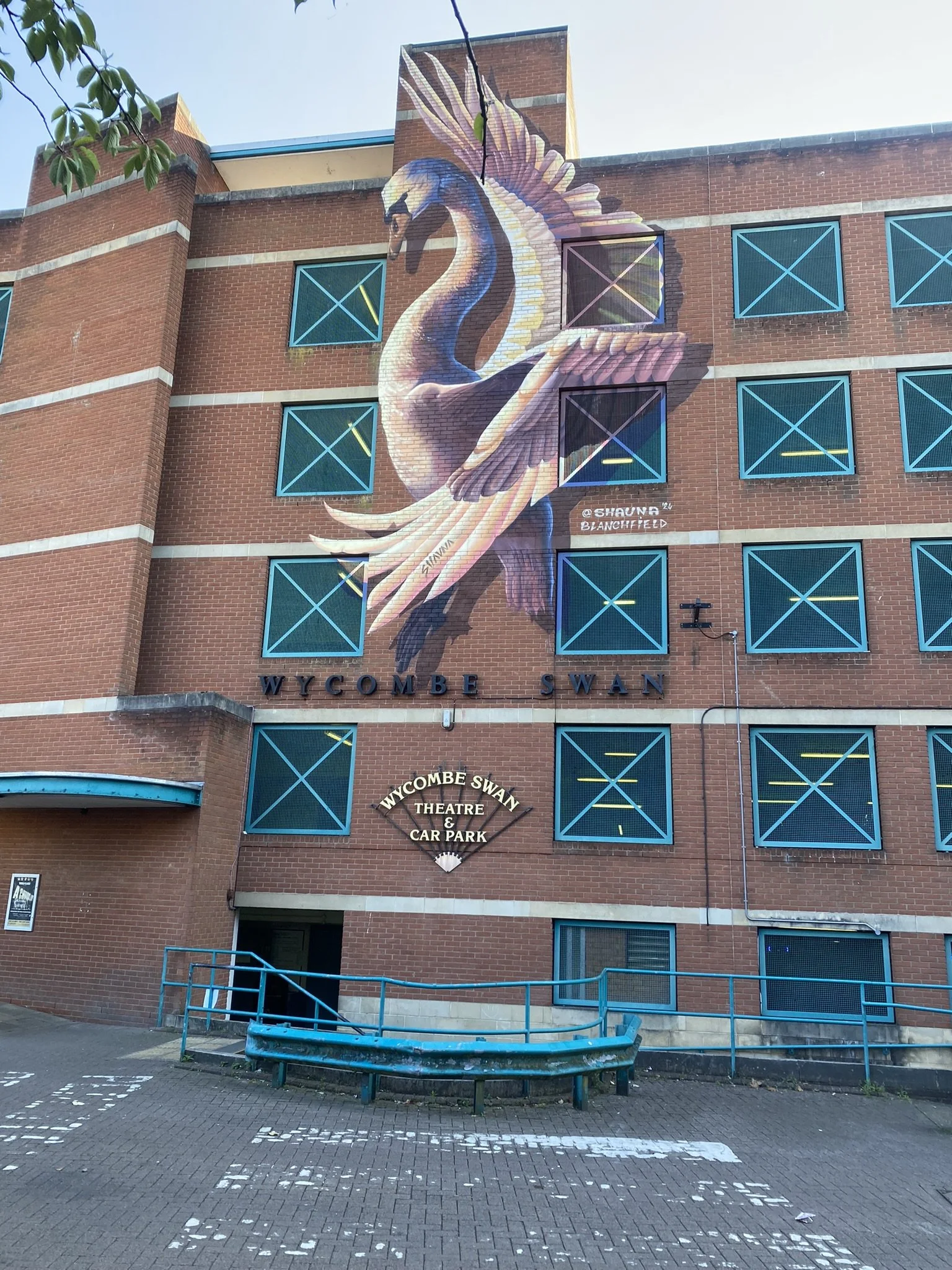
The Artwork
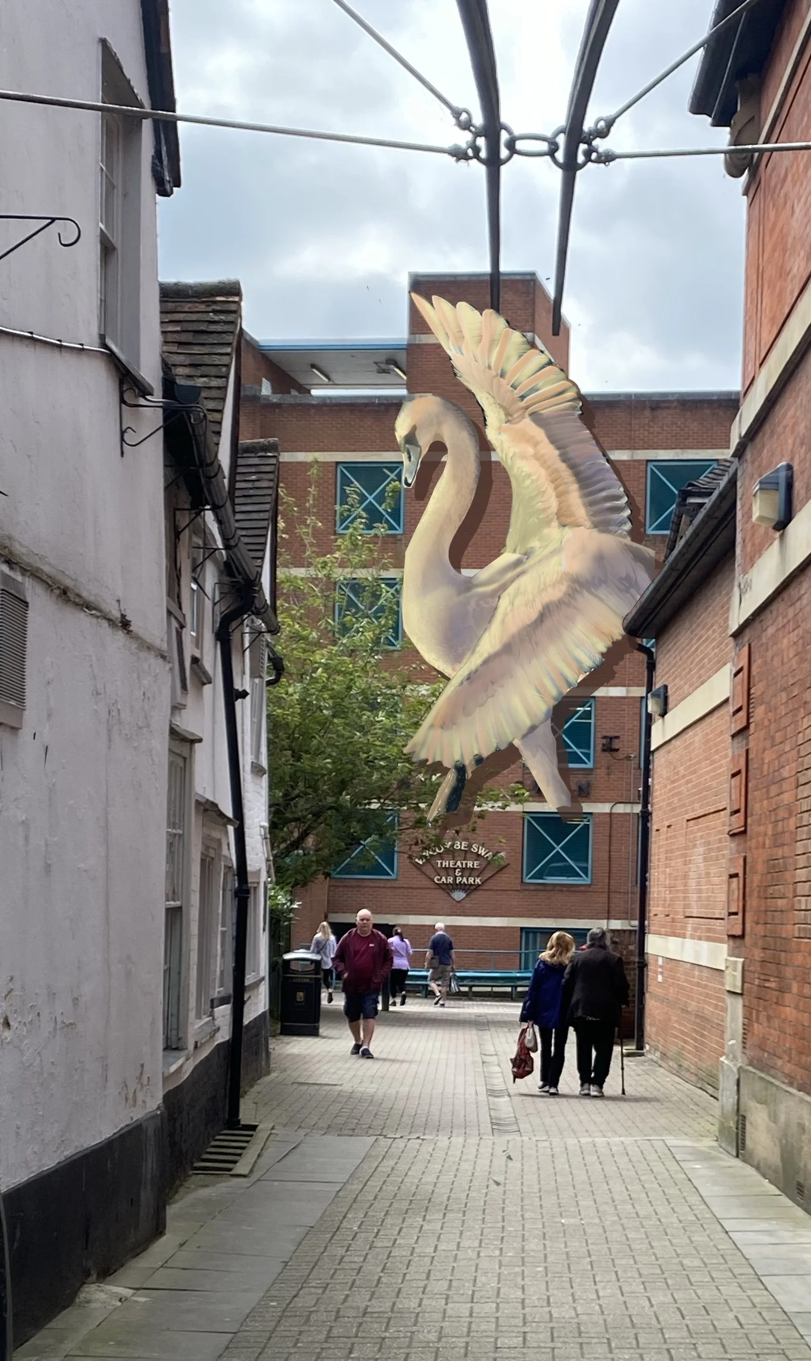
The finished mural is a four-storey swan painted directly onto the brick façade of the car park.
The wings extend both upward and downward, creating a vertical rhythm
The swan’s feet land directly onto the existing “Wycombe Swan” signage
A painted drop shadow creates the illusion that the figure lifts from the wall
Materials & finish:
Medium: spray paint
Surface: unprimed brick
Finish: Polyvine Decorators Varnish (Dead Flat)
Access: 20m cherry picker (boom lift)
The absence of a background allows the brick to remain visible, reinforcing the intended weathering to slightly weathered lime-wash effect. The dead-flat varnish protects the work while eliminating sheen, ensuring it integrates with the building rather than sitting on top of it.
The Outcome
The mural has become an immediate visual shorthand for High Wycombe.
It now functions as:
a wayfinding marker (“turn right at the swan”)
a symbol of the cultural quarter
a recognisable image used by residents and visitors alike
The artwork plays a practical role in orientation, helping people navigate towards the theatre and surrounding cultural venues. It is also the first visible marker in an ongoing programme of regeneration, setting a clear visual tone for what follows.
Community response has been strong, with the mural quickly adopted as a point of reference and local pride.
Why It Worked
This project succeeded because it matched the right approach to the right context.
In a space where the identity was already clear, the strength lay in refinement rather than expansion. The swan did not need reinterpretation, it needed to be resolved, scaled, and positioned with confidence.
The success of the mural came from:
a clear, singular idea
disciplined restraint
strong collaboration with the regeneration team
sufficient time to develop an image suited to a complex site
Where other projects benefit from multiple voices, this one benefited from focus. The result is a landmark that feels inevitable, rather than imposed, a symbol that now anchors the place it represents.
“What a treat it has been to see high quality public art in the town. This lays the foundation for other enhancements in this location and sets the tone for what can be achieved across the county”
Press and Coverage
19 August 2024: Bucks Free Press | Wycombe Swan undergoes exterior regeneration project
Is visual placemaking the right approach for your project?